The main purposes of a film poster are to adversities and promote the film to it audiences. This can be done by the poster having components such as when the new film is due for realise so that the audiences can generate a sense of excitement about the film. There are many different elements a film poster entails such as; the name of the film it is promoting, release date, the actors/ actresses and director who are in the film, these are the information that a film poster entails to attract their viewers. There are also visual elements of film poster that can attract the audiences such as the pictures and the character in the film also title and the font of the poster. As the photo and graphics of the poster can suggest a particular genre and narrative of the film which can allowed the audience to get a insight to what the film will be about.
Sky Fall

When looking at the film poster there are many visual elements of the poster that draw the audiences into the film. For example, the colour scheme, there are contrasting colours used as the black and white background shows the simplicity of the film and the profession that comes with it, as we notice the costume the character is wearing which suggest power and impotence, also we can see the posture and body language of the character which shows his confidence. In addition If we look closely into the characters faces we can see his serious facial expressions which gives out the picture that the film has elements if seriousness to it also the chiaroscuro lighting gives out a very serious and mysterious look to the poster. From looking at the picture it look likes the character is coming out a tunnel. On the side we can waves in the background this might be to show a setting of a beach. The tunnel in the picture can show how he is on a dangerous path way walking into the dark side as he is walking into the tunnel as we can see the light behind him.
When looking at the typography the whole poster is black and white we notice the gold on the iconic 007 logo which stands out the most, this is used to mostly draw the previous audiences in and letting them know that this is another 007 film. Also the name of the film is in capitals letters this can be to add emphasis and draw attention to it. We cannot see the setting of the film the poster doesn’t give away must about the film and narrative the target audiences of the film looks like fan from the James Bond franchise which shows the director is relaying on the audiences foreknowledge and expectations of previous James Bond films which why there is less information given out so the audiences can be left excited and see how the film turns out.
Looking at the poster we can clearly see what the genre of the film is for example if we look closely to the characters hand he looks like he's holding a gun which gives out the impression that is film has conventions of action also background it looking like a tunnel gives the impression of action adventure genre as the setting of the picture looks very unusual. From looking at the poster I can see that the target audiences is a male audiences purely because of it dark bold colours (black and white) also the character is males character which is being placed right at the centre of the film poster, furthermore the typography of 007 has a gun logo attached with it which shows its masculinity. I would say the film is aimed toward young adult because of the seriousness and profession that we can see in the poster. I would say that there is tag line "007" which draws the audiences into the film letting them know that is another 007 film form the James Bond series, the tag lines does reinforce genre of the poster because of the gun icon attracted to it which gives out a hint that the film is action film.
Insidious
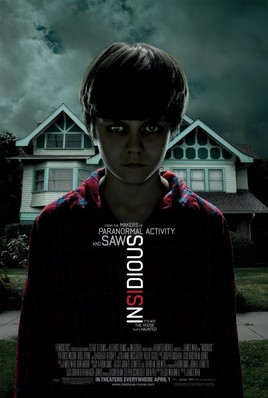
When looking at the film poster there are many visual elements of the poster that draw the audiences into the film. For instance, the colour scheme, we can see that the overall poster has very dark elements of colour to it which creates a very sinister tone to the poster. Also looking at other elements of the picture the sky has a very dull and grey tone as well as the pyjamas the boy is wearing which is dark red and dark blue which gives out the impression that the film is very ominous and gloomy. There is one element of bright colour the white and red text which stands out and also gives out hind of what genre this film is as the red show horror and blood the typography is also conveying to the audience the sinister nature of the film itself. Looking at text we can see that there is a form of director credit as there are text that mentions other film made by the director which get the audience to know what to expect form watch the other films the same director has done. Also when looking closely into the text we can tagline is used “it’s not the house that is haunted” this is written in the font as the name of the film the text is placed underneath the name of film.
When looking at the main image of the picture we can that medium shot presumably of the main character of the film. The media shot allows us to see the characters facial expressions as we can see the boy’s skin tone is very deathly and dull we can also see this through his facial expressions. Behind the character we can see a house which tell us about the setting of the film we as the audience can make some assumption that main setting of the film is going to be in that house.
When looking at the main image of the picture we can that medium shot presumably of the main character of the film. The media shot allows us to see the characters facial expressions as we can see the boy’s skin tone is very deathly and dull we can also see this through his facial expressions. Behind the character we can see a house which tell us about the setting of the film we as the audience can make some assumption that main setting of the film is going to be in that house.
Pulp Fiction

This is one of the most iconic film posters of all time on the award winning Pulp Fiction film. Looking at the images used for this poster you can immediately identify that it is a crime film because of the gun as it is seen as a convention from the crime genre. The main image being displayed on the film poster is of the main character. This allows the poster to introduce to the audience the type of character she is which will help the audience to pick up on the genre and help to further the narrative. This is because of her costume consisting of an all black jumpsuit, as well as her serious facial expression being emphasised. The title of the film is written big and bold in yellow font, using capital letters in order to establish the title of the movie. It is important for a film poster to clearly establish the title of the film in order for the audience to identify it and maybe already start to predict the narrative. They might also depict it as a sequal or developed from a known novel.
