Bad Heart Productions Audience reviews/ Evaluation
What ways does our media products use, develop or challenge forms and conventions of real media products?
Looking at the film poster we created for our thriller film "Lookalike", the conventions we used consisted of a clearly shown film title with a tagline, "every man has his weakness". This allows the audience to depict what our film is going to be about, whilst also being able to address the genre, and some aspects of the characters involved in our film. We continued to follow conventions of film posters by including the three main characters of our film in our poster, looking directly at the camera. This allows the audience to feel the characters and feel involved with there being no seen barriers between them and the characters as they are looking directly at them.
Looking at our thriller film trailer, we seemed to have followed conventions within this genre of film. These conventions included fast paced editing with shirt takes of scenes backed up with suspenseful music and crescendo sound effects. Also, the majority of the shots we used in our trailer had dark chiaroscuro lighting which follows conventions of real thriller films. We also included shaky footage to establish a character running in a POV shot to make the audience feel the way the character does, putting them in her shoes feeling her anxiety and frustration that is also shown through heavy breathing sound effects.
Our entire film trailer is based in an urban setting which is common for thriller films as they tend to include the gritty reality we live in. We also chose to be set in an urban environment in order for our target audience to relate to it more as they are young adults living within the same environment. This would help them to use their foreknowledge and understand of these urban areas and make expectations of what might occur.
What have we learned from our audience feedback?
|
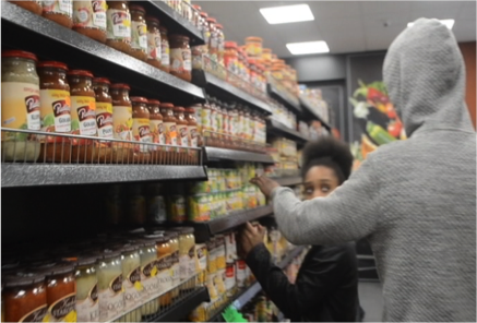
We intentionally chose a young female character with small height difference to male character, which we thought would add emphasis on her vulnerability as she is small and pretty whereas the male character in the film is taller. Our target audience have said this has made them feel really empathetic towards the female character. One particular scene our audience feel greater empathy towards our female character is when we intentionally used close ups during the shopping scene which add emphasis on the height difference as the antagonist looks down on the female character while she is doing she shopping. As a result of this we enhanced the suspense because the audience cared about the main female character.
There were two particular shots were the antagonist was completely in the dark which meant the audiences could only see his shadow therefore the audiences could not see his face as we wanted to hide his identity to create confusion. This also helps create suspense as humans usually fear the known since the audience cannot see the antagonist face they are afraid of what might happen to the female character.
|

|
|
With our magazine cover, we had contrasting colours of black and white background which the audience felt that helped hooked them into the film a lot as this helped create a dark and foreboding atmosphere. The graffiti makes it seem like an urban environment, which was attractive to our audiences as they find urban culture fascinating and interesting. Since our target audience 18+ most of the feedback we got from them was that they really liked the urban look to the magazine as they like the street culture and find it captivating to watch. The urban background helps the female character fit magazine cover as her costume is very urbanely, for instance her boomer jacket as well as her hooped earing helps create this look which our target like as they could relate back to her look.
|

|
|
With our film poster we used key mise en scene aspects such as costume to add emphasis on our genre of the film. The Adidas jumper the character wears can communicate the urban look of the whole image, our target audience liked the costume that was used in the film poster as they said they could relate back to what they wear which hooked them into wanting the trailer of the film. Our target audience said they could identify the genre of the film as the use of compositions helped since the female character in the middle they said that they can tell she is stuck in the middle between the who character which gave them the idea that something suspicious it going to happen.
|

|
How effective is the combination of our main product and ancillary texts?
I would say that my film trailer, magazine cover and poster all integrate with each other. This is because the image we used for both our film poster and magazine are similar, with the colour scheme and font being the exact it to show the connection between them as they are advertising the same thing, our film trailer. Since thriller was the genre of the film we decided to put together the code and conventions of a thriller into our three different products we did this so that it was clear what we needed to add to attract and keep our audience engaged across all our products, we felt that will increase the effectiveness of the whole products. Once we had done our research of real film posters we had a clear idea of the purpose of film poster, which was to advertise the film through different techniques such as ( title, images, actors and tagline) Even though the film poster we created was simple and did not encode a lot of information about the film i believe was effective mostly because it draws the audience into film a lot more. The female character helps draw the audiences into the film as she is main character of film and magazine covers therefore the audience can see the link between all the products, this hooks the audiences as it provides synergy by the image of the female character featuring across all the products. I also think the magazine demonstrates effectiveness in combing the other products as it continues to display the same image of the female character along which add emphasis to the thriller genre as one of the main codes and conventions of this genre dull and dark colours which all products encode along with the main female character.
How did we use media technologies in the construction and research, planning and evaluation stages?
